The use of colour in a data visualisation can determine the success or failure of data interpretation.
Colour is intrinsically linked with psychology. This means that colour can play an important role in how people understand information. Studies also indicate that colour usage impacts our ability to learn, retain, and interpret the information we receive. Furthermore, colours have emotional connotations that can impact how we subconsiously interpret visual representations. Colours can even influence data-based decisions within data reporting.
Read on to learn more about how you can use colour in data visualisations for greater success.
Table of Contents
Join the BDI mailing list
Keep up to date with the latest events, webinars, and product launches from BDI.
Sign UpConsider colour theory when designing data visualisation
Through popular culture and human history, colours often have emotional connotations attached. This is known as colour theory, and it is an important design principle. For example, red connotes power, passion, and anger. Blue, on the other hand, indicates coldness, logic, or calm, depending on context. Even different shades of the same colour can convey different meanings.
When using colour in a professional context, consider the emotional subtext you are conveying. The first impression your audience forms when looking at your data visualisation will likely be shaped by the colours used before any information and data are processed.
Relate colour to what it represents
Considering the aforementioned relationships between emotions and colour, taking advantage of subtextual meanings can make information easier for users to interpret.
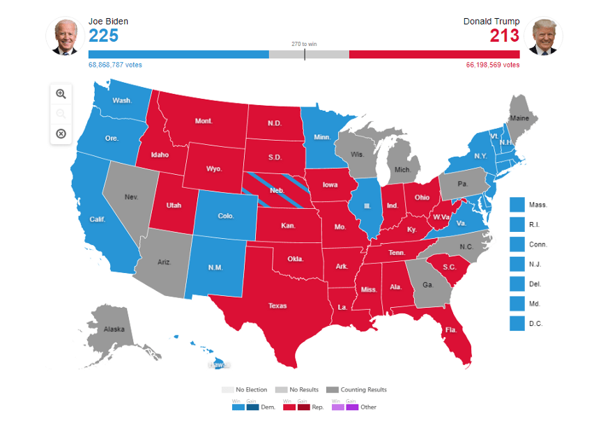
Take the US 2020 election maps, for instance. Viewers could quickly understand the election outcome from a glance due to the colour usage. The colours red and blue are intrinsic to the branding of the Democrats and Republicans, much like Labour and the Conservatives in the UK. Visualising voting outcomes on a map in each party’s colours, therefore, provides a quick indication of the dataset.
Alternatively, red and blue provide a clear meaning when used in the visualisation of temperature: audiences can safely guess that blue refers to cold, whereas red refers to warmth.
You can further develop colour association through branding. When creating data visualisation as a set, use the same colour to represent a particular concept within a theme. This allows users to glance through the visualisations and gain a rough understanding of what is in front of them without too much effort.
Highlight important data through colour
Sometimes, the use of colour becomes even more conspicuous when it is used sparsely. For example, consider using a pale neutral colour, such as grey, to represent contextual data when visualising trends. Using a pop of colour for key data then makes it stand out more against the background, enabling your audience to understand information more quickly.
Using too much colour makes it difficult to understand data
If your organisation is using colour to make data easily understandable, then be careful not to get carried away. Using too much colour can actually have the opposite effect.
In fact, American research into military systems design argues that humans can only comprehend between five and seven colours at a time.
Using more than seven colours, therefore, leads to audience distraction when interpreting data visualisations. If your data visualisation design requires many different colours, you are likely displaying too much information.
Choose easily distinguishable colours
Christopher G Healey, of the University of British Columbia’s Department of Computer Science, argues that colours should be chosen from distinct sections of the colour spectrum rather than close together. An example of this would be choosing red, orange, and yellow shades rather than varying shades of red.
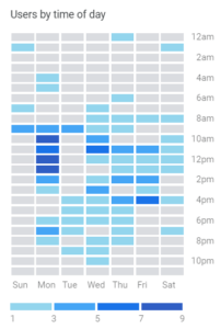
However, it is possible to use different shades of the same base colour, but ensure they vary in intensity. This allows an audience to quickly differentiate between them. The Google Analytics ‘user heatmap’, for example, does this well.

If you are not confident that the difference in shades is distinguishable, then play it safe and go for different complementing colours instead.
Apply contrasting colours for visual comparisons
Contrasting colours are more comfortable for audiences to look at, especially for comparing data. They are also more accessible to visually impaired people as they provide a clearer difference between visual elements.
Consider the colours you have chosen in relation to their location on the colour spectrum. For example, a red line and an orange line on a chart will be different to distinguish from each other. A red line in the same chart with a blue line, however, will be easier to compare.
Stick to a consistent colour for a metric
If your data visualisation displays a metric over a series of time, use only one colour. For example, displaying a company’s revenue over several consecutive billing periods requires only one colour. This demonstrates a consistent dataset is being shown.
Working in this manner creates a consistency across your reports, and makes important information even easier to understand. Rather than having to search for a colour in the key of your data visualisation to determine which colour represents a metric, a quick glance provides the audience with the information they need.
Conclusion
Decisions over colour usage within data visualisation should be a conscious choice due to subtextual messages they can convey. Consider not only the emotional connotations behind the colours chosen but also how easy or difficult they are to see on a smaller scale.
If colour choice is a difficult decision, the default colour schemes included in Microsoft Office are often a good starting point. The colours included in Microsoft themes are often complementing and vary in shades to make it easy for users to create visually appealing documents.
By far the most important element of using colour in data visualisations is to use colour to enhance but not overpower your data. Avoid getting carried away in colour usage, and use it sparingly for a bigger impact.
Ready to start?
Our team of data intelligence experts are ready and waiting to work with your organisation


Recent Comments